WPG Roofing Redesign
A 15-year-old Winnipeg roofing and exterior contractor with real credentials and genuinely well-written copy — trapped inside a Weebly template built on HTML tables.

The original site had the content problem solved. The copy was clear, the voice was genuinely honest (the site told customers it would recommend a repair over a replacement when that was the right answer), and the credentials were legitimate: $5M insured, Shingle Master certified, WCB member, 15 years in business. What the site didn't have was a frame that let any of it land. It was built on HTML tables that break the layout at most viewport sizes, trust badges floating as unstyled acronyms, a services section where every card began with the literal word 'Picture' because image metadata leaked into the table cells, and a dense hero where four separate elements fought for the eye. The problem wasn't what the business was saying. It was that the site was actively undermining every word.
Every improvement is structural. The brand is intact. The words are intact. The site just finally makes them legible.
Speculative redesign of a real Winnipeg roofing and exterior company, rebuilt unpaid as a portfolio project. The company name and identifying details are changed — the rebuild is referred to throughout as WPG Roofing — but every problem below was observed on the actual live site.
The Problem with the Original Site
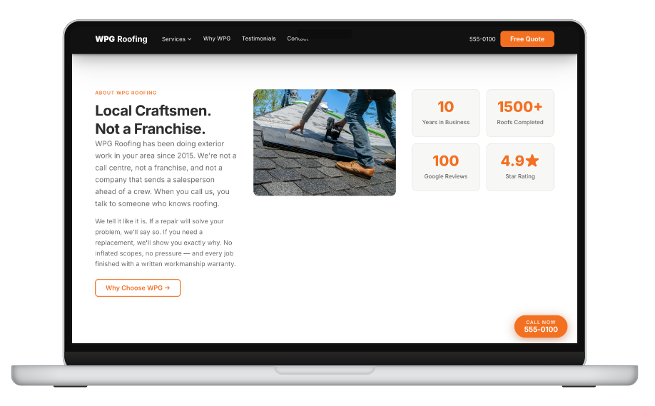
The roofing company had done the hard work of building a legitimate business. Fifteen years in, $5M insured, Shingle Master certified, WCB member, and — unusually for the trades — copy that was honest about the limits of what they’d recommend. The site told customers it would suggest a repair when a full replacement wasn’t warranted. That’s the kind of thing a homeowner actually wants to read.
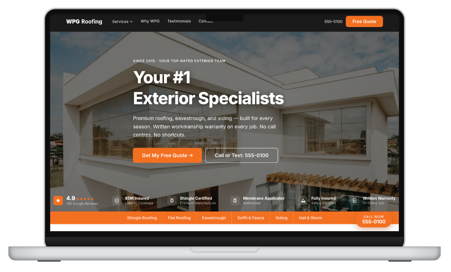
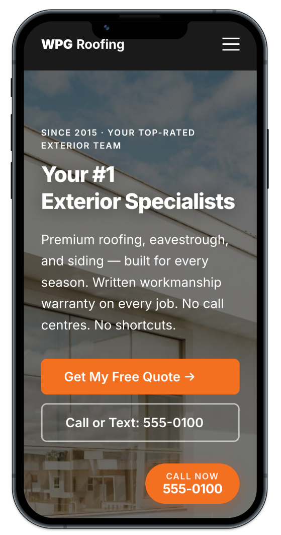
None of it registered. The site was built on a Weebly table layout that broke at most viewport sizes, with trust badges rendered as unstyled text acronyms buried in the footer, a services section where every card opened with the word “Picture” (a metadata bleed from the original image table cells), and a hero where a headline, tagline, phone number, and certification badge all competed for the top of the page with no resolution between them.
The content was strong. The architecture had collapsed around it.
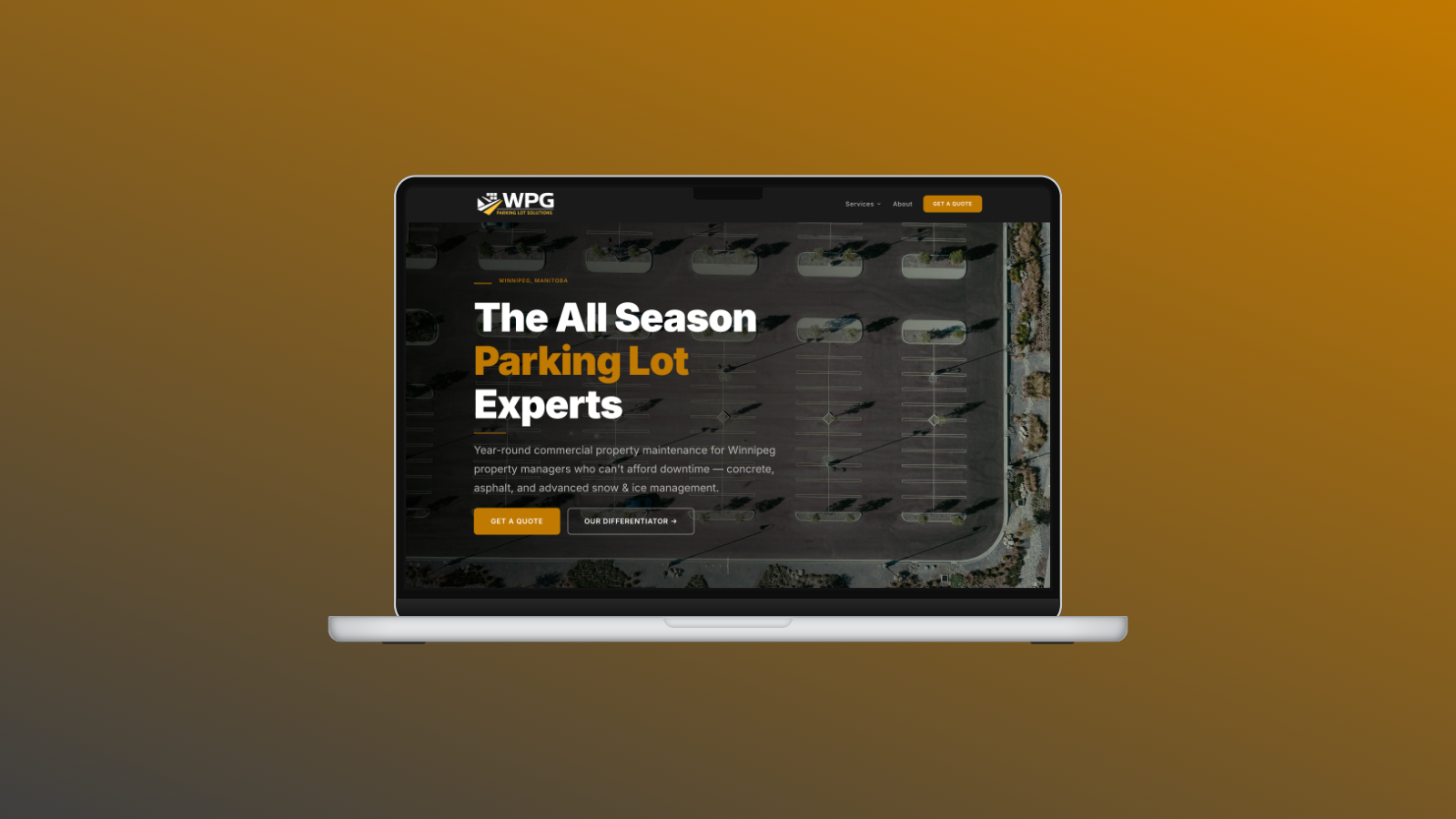
The Rebuild
The rebuild is a structural fix, not a content rewrite. Every piece of copy, every service description, the honest repair-vs-replace positioning, the 15 years in business — all carried forward nearly verbatim. The only changes are in structure and presentation.
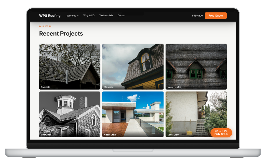
The table-based layout is replaced with a proper CSS grid. The trust signals — insurance level, certification, WCB membership, years in business — are extracted from the footer and assembled into a dedicated credentials bar that runs above the fold. The services become a real card grid. The hero hierarchy is resolved: one headline, a supporting credential line, a single call to action.
Built in Astro, with Claude Code handling the development workflow and structural decisions.
Same voice, same copy, same credentials — rebuilt on a frame that finally lets them do their job.
Have a project like this?