Fire Protection Company Redesign
A full rebuild of a Wix-based fire protection company site. Inconsistent credentialing, broken visual elements, and no CTA hierarchy made the original site look untrustworthy — a serious problem in a compliance-driven industry.
The original Wix site had conflicting copy (claimed both 14 and 20+ years of experience on the same page), broken SVG rendering, and no clear path for a potential client to take action. For a company whose entire value proposition is trust and compliance, the site was actively working against them.
In a compliance industry, your website is either proving you're competent or it's the reason you didn't get the call.
Speculative redesign of a real Winnipeg fire protection company, rebuilt unpaid as a portfolio project. The company name and identifying details are changed — the site has been renamed Shield Fire Protection — but every problem below was observed on the actual live site.
The Credibility Problem
The companies hiring a fire protection contractor — property managers, building owners, facilities directors — are not shopping on price. They need a vendor whose paperwork is clean and whose work holds up on inspection day. The site is often the first thing they check. If it looks unreliable, so does the company.
The original Wix site failed that test visibly. The headline claimed 20+ years of experience; a different section said 14. That’s not a typo — it’s the kind of inconsistency that reads as disorganised, and in a compliance-driven industry, disorganised is disqualifying. SVG icons weren’t rendering correctly in several browsers, and the contact form was buried well below the fold with no clear prompt to use it.
The Rebuild
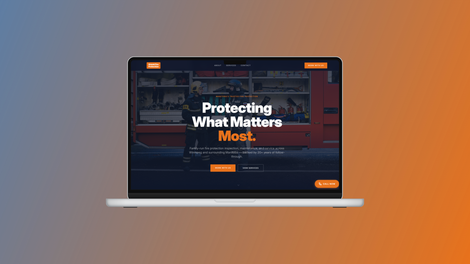
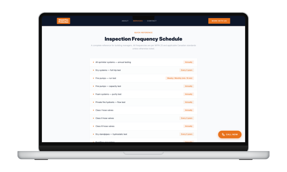
The rebuild put the credibility arguments where buyers actually look: above the fold on every page. Experience claim, certifications, and service scope established in the first scroll. The contact form moved to a prominent position with a direct prompt.
Built in Astro, renamed Shield Fire Protection for portfolio purposes. Claude Code handled the development workflow and first-draft copy. Getting the tone right on the compliance messaging — specific enough to be useful, plain enough not to intimidate — was where iteration mattered most.
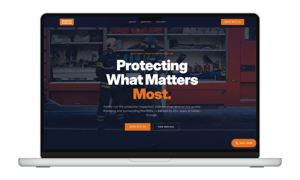
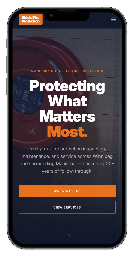
Consistent, trustworthy credential presentation across all pages, a clear primary CTA hierarchy, integrated contact form, and a clean mobile experience. The site now matches the professionalism of the service being sold.

Have a project like this?